Let’s face it—colors matter. Whether you’re designing a storefront sign, a banner, or any kind of signage, the colors you choose can do more than just look nice. They have the power to grab attention, create a mood, and tell your brand’s story, all without saying a single word. Choosing the right palette isn’t just a design decision; it’s a business strategy!
Here’s how to make color work for your brand’s signage.
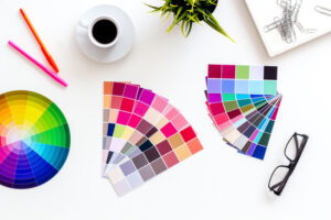
The Power of Color in Design
There’s a psychology behind colors as they evoke emotions and convey meanings. For example:
- Red grabs attention, conveys urgency, and is often used in sales or clearance signage.
- Blue communicates trust and professionalism, making it popular for corporate or healthcare brands.
- Green represents growth, health, and sustainability, ideal for eco-friendly businesses.
- Yellow is cheerful and optimistic, drawing attention while creating a sense of approachability.
Understanding the emotions tied to colors helps you choose the right palette to reflect your brand’s identity and appeal to your audience.
Match Colors to Your Brand
Your brand has a personality, and your signage should reflect that. If your business focuses on luxury, sleek tones like black or gold can show off your sophistication. Are you a fun, family-focused business? Bright, playful colors like orange and yellow might be a better fit.
The key is consistency. Stick with the colors already in your logo or marketing materials so your signage ties into your overall brand identity. When everything works together, your business becomes instantly recognizable.
Make Your Colors Work for You
The colors you choose should do more than just look good—they should make your signage effective.
- Contrast: Use high-contrast combinations, like light text on a dark background, so your message pops.
- Focus: Highlight key elements like your logo or a special offer with bold colors to draw attention.
- Environment: Consider where your sign will be. In a busy city, bright colors might be necessary to stand out. In a quieter, natural setting, more muted tones could work better.
Test Before You Commit
Before you finalize your design, it’s smart to test how your colors look in real life. Will they hold up in bright sunlight or dim lighting? Do they look as sharp on a sign as they do on a screen? Small tweaks can make a big difference, and working with a professional ensures everything turns out perfectly.
At Hollywood Signs and Graphics, we specialize in creating custom signage that captures attention and reflects your brand’s unique personality. We offer a wide range of signage solutions, from indoor and outdoor signs to vehicle wraps, wall murals, banners, window graphics, floor decals, and large-format printing. Serving the greater Portland, Oregon area and beyond, we’re here to bring your vision to life with high-quality, custom designs!
Visit us online to explore our capabilities, and call (503)492-7446 to get started.

Leave a Reply